Have you ever stopped to think about what makes your favorite social media platforms so engaging? Is it the content alone, or could it possibly be something as seemingly trivial as the colors they use? Imagine scrolling through your feed without vibrant hues or striking contrasts—would it still hold your attention?
Color isn’t just about a design element, it’s a silent communicator that evokes emotions and shapes our perceptions. But how does this phenomenon translate into the digital world of design that surrounds us daily?
What does Psychology Have to Do with Design?
Let’s dive into the fascinating realm of psychology and design. Humans are inherently visual creatures, and our brains are wired to respond to visual stimuli.
When we see colors, they trigger specific emotional and psychological responses. For instance, warm colors like red and orange tend to evoke feelings of excitement and energy, while cooler tones like blue and green often evoke calmness and tranquility.
Understanding these principles allows designers to craft experiences that resonate deeply with their audience.
Some of the Best Color Psychology Approved Designs
In the world of design, mastering color psychology can elevate a project from good to exceptional. Take, for example, the Coca-Cola logo—a timeless symbol of happiness and joy, thanks to its use of vibrant red.
Similarly, the soothing blue tones of Facebook’s interface promote a sense of trust and reliability, encouraging users to engage with the platform for longer periods.
From the bold simplicity of Apple’s logo to the inviting warmth of Starbucks’ green, each design choice is a strategic move to evoke specific emotions and associations.
ARDE's Design Experience and Inspiration
Enter ARDE, a design agency renowned for its innovative approach and stellar clientele. With a keen understanding of color psychology, ARDE has crafted breathtaking designs that captivate and inspire.
From sleek websites to eye-catching logos, their portfolio speaks volumes about the power of thoughtful design.
By carefully selecting colors that align with their client’s values and objectives, ARDE creates experiences that leave a lasting impression.
Emotionally Connect with Your Audience Through Brand Colors
Your brand’s colors are more than just a visual identity; they’re a powerful tool for emotional connection. Consider the iconic golden arches of McDonald’s—a beacon of familiarity and comfort for millions around the world.
By consistently reinforcing these colors across its branding, McDonald’s embeds itself into the hearts and minds of consumers, creating a powerful message that transcends language barriers.
Whether it’s the passion for red or the serenity of green, choosing the right colors can communicate volumes about your brand’s personality and values.
Prominent Colors and Their Emotional Impact
Let’s explore some prominent colors and the emotions they evoke:
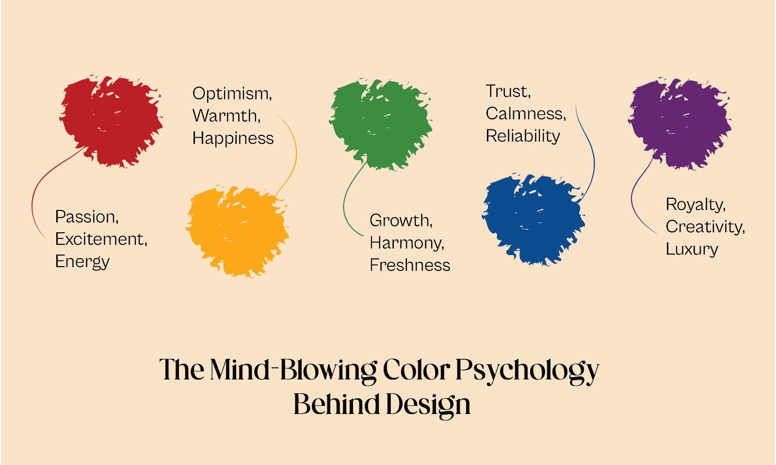
- Red: Passion, excitement, energy
- Blue: Trust, calmness, reliability
- Yellow: Optimism, warmth, happiness
- Green: Growth, harmony, freshness
- Purple: Royalty, creativity, luxury

In the colorful tapestry of design, the psychology behind color is a thread that weaves together emotion, perception, and communication. From the vibrant hues of a logo to the soothing palette of a website, every design choice carries the potential to leave a lasting impression on its audience.
By harnessing the power of color psychology, designers can create experiences that not only engage but also resonate on a deeply human level.
So, the next time you find yourself drawn to a particular design, take a moment to appreciate the subtle magic of color psychology at work. After all, the world is a much brighter—and more meaningful—place with a little splash of color.

